Designing for growth inside a locked room
How I reshaped a premium Arabic investment education community — from navigation to onboarding to gamification — entirely within Circle.so constraints, driving 416% revenue growth in three months.
3 months
3% → 10%
in 90 days
first month
A product with potential and a platform that resisted it
KanzMS launched in October 2025 as a premium Arabic investment education community. The product existed: a Circle.so community and a landing page. But the product experience told a different story. Navigation was bloated. The brand was inconsistent. The onboarding dropped people into a wall of content with no direction. Conversion was sitting at 3%.
I joined in December 2025 as part of a three-person design team. By February, I was the only designer. The task was not to rebuild — it was to reshape. Every solution had to live inside Circle.so’s constraints, which are significant: no custom layouts, limited styling control, a sidebar that resisted restructuring.
Circle.so as a constraint, not an excuse
Most of the limitations I faced were platform problems, not design problems. Circle.so is built for communities, not brand-driven products. Its default sidebar displays every space as a flat list. Its builder produces generic pages. Its emails carry its own visual identity by default.
Used Circle’s iframe and custom code injection to build fully branded pages inside the community without touching Circle’s native builder. Applied the same approach to transactional emails to maintain brand consistency end-to-end.
Outsourced forms and surveys embedded directly into onboarding posts — a continuous research stream without interrupting the member experience or requiring a separate tool.
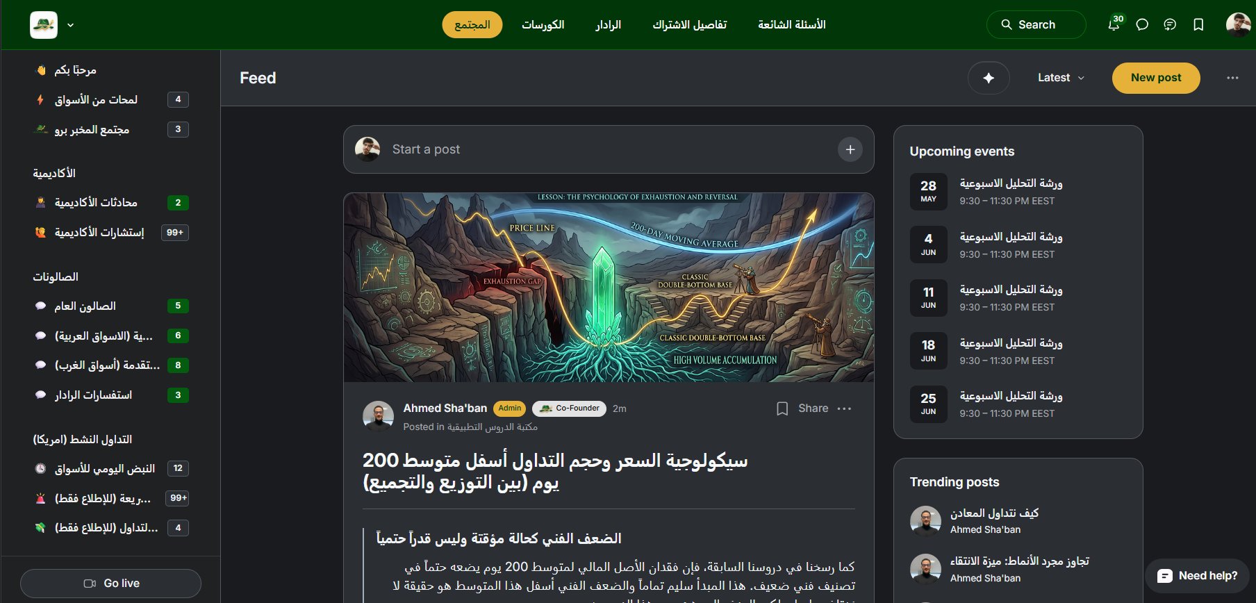
Rebuilt the sidebar information architecture: fewer top-level spaces, grouped by member intent, structured to make the product feel curated rather than sprawling.
Three decisions that moved the needle
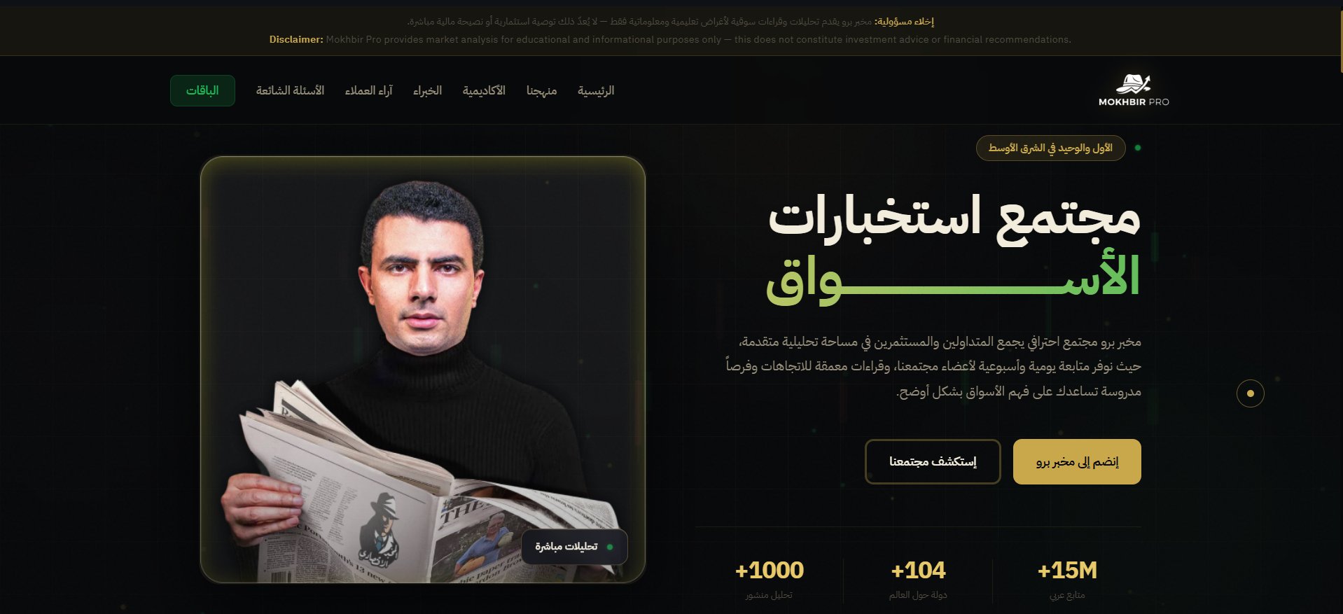
The original page listed what the product offered. The redesign asked a different question: what does it feel like to be a KanzMS member? Dark gold design system built from scratch, editorial Arabic typography, RTL-first layout. The page stopped selling access and started selling belonging.
The sidebar had become a directory of everything. I rebuilt the information architecture around member intent — what they came to do — not around what the platform could display. Fewer top-level spaces, clearer hierarchy, a restructured onboarding flow that followed naturally. This reduced friction at the exact point where most members previously disengaged.
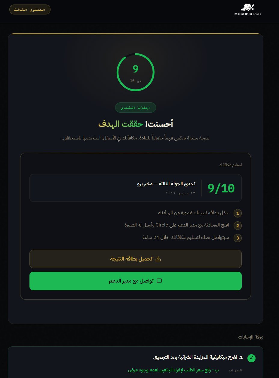
A weekly quiz system with localStorage attempt-blocking, an SVG countdown timer, and a downloadable score card. It gave members a reason to return on a fixed schedule and created a social proof layer through shared results. 300 responses in its first month confirmed it became one of the most-used parts of the product.
Decisions grounded in evidence
I led the research process for every feature I built. That meant competitive analysis using 1:1 benchmarking against comparable Arabic investment education products — identifying where KanzMS was over-delivering on low-impact features and missing on high-signal ones.
One finding changed the product roadmap: the most-retained users in comparable communities had direct, personal access to an expert. This led to introducing 1:1 sessions as a product feature. A positioning move as much as a design one — it created exclusivity and differentiated the offering from platforms that only provided content.
Embedded forms in Circle onboarding posts gave me a continuous research stream throughout. Data shaped every subsequent design decision rather than informing it after the fact.
What the numbers confirmed
Measured from December 2025 to February 2026. Marketing contributed to user growth, but the product changes — navigation, onboarding structure, landing page, and gamification — were the primary driver of conversion improvement. Growth is ongoing.
“The best design I did here was never visible. It was in the decisions about what not to build.”
Working alone inside a constrained platform forces a kind of clarity that a full-stack team with unlimited budget rarely achieves. Every feature had to earn its place. Every workaround had to be invisible to the member.
Conversion is almost never a landing page problem. It is an information architecture problem. When members understand where they are, what they have access to, and what to do next — the numbers move.